There is something delightful in the repetition of an aesthetic. Book sets where the titles all align and the publisher logo is set at the bottom. Ikea boxes with the same bold typeface and wireframe image of the product on a white box. Adobe app icons. Most important to me however are the movies I own from the Criterion Collection.
Anyone who collects movies on Blu-ray or DVD probably has at least heard of Criterion. Classic, International, and Independent films that don’t always get enough love from previous home-video releases get a chance at reaching new audiences through a Criterion release. They also always get a really, cool cover.
Take for example The Silence of the Lambs. On the left is the Blu ray released in 2009 and on the right is the Criterion release from 2018.
One of my favorite aspects of a criterion release is that it doesn’t have a blu-ray logo on top clashing with the artwork. The Criterion logo is subtly tucked away in the corner and the cover art is so striking it takes a second before you notice a logo is even there. If you hadn’t seen the movie before and you saw both of these on the shelf you would grab the one on the right.
Now, I have a problem. I LOVE my criterion collection films, but not all the films I love have a criterion release. The spines that line up on the shelf are marred by other poor, inconsistent packaging.
I decided to make some of my own.
The first one I wanted to change was my copy of Mad Max: Fury Road. This is what it looks like:
This is bad.
And this is the one I made:
This sparks joy.
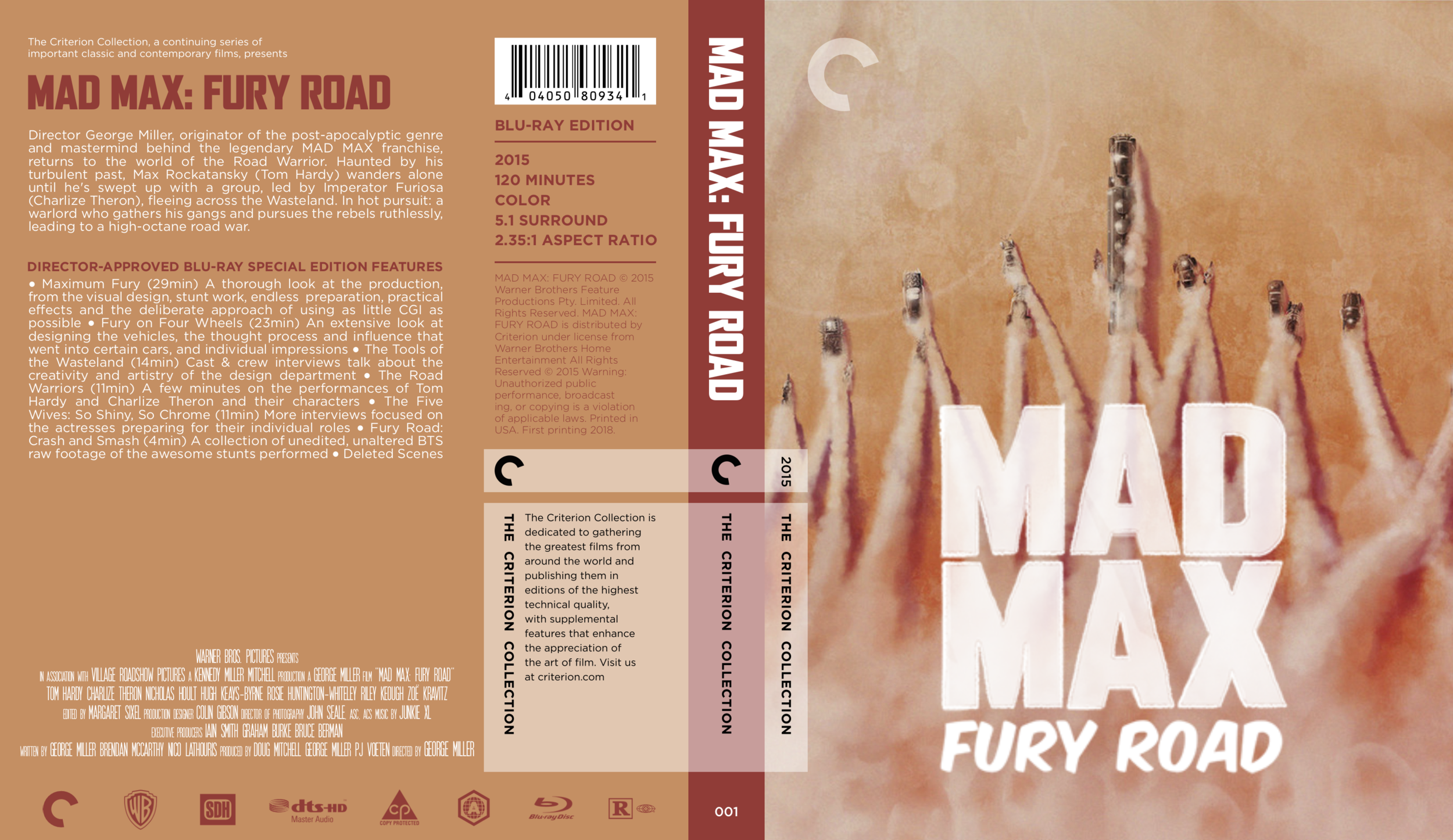
To clarify, I did not do the artwork. That was done by a very talented artist named Raj Khatri. I also did not start with this artwork. My first draft looked like this:
At first I really liked the look of it. I loved the painting I found because it was simple and I liked the color palette. It was fun to build a design around it. However, once I was done it just didn’t FEEL like Mad Max. I decided I wanted a piece of art that matched that same yellow and teal color palette the film wore with such style.
I really wanted to make that middle one work.
After looking around I found the one I liked and largely kept the same style on the back but tweaked the color to match the new artwork.
I still liked the new image more but I couldn’t seem to get the design around it right. Looking on it now it seems really loud. With such a vibrant gradient between the blue and the brown in the artwork I needed something more neutral for the back cover and text. In the end it made more sense to use as much black as possible to make the artwork stand out.
I haven’t printed this out yet out of fear for how much ink it will take but if the detail of the printer can handle the small text I think this is such a great improvement compared to the first version. Mad Max: Fury Road was the first Criterion edit I did and I think it still might be my favorite.
I hope this inspires you to make your own and I’ll include an update when I actually get to printing this!


